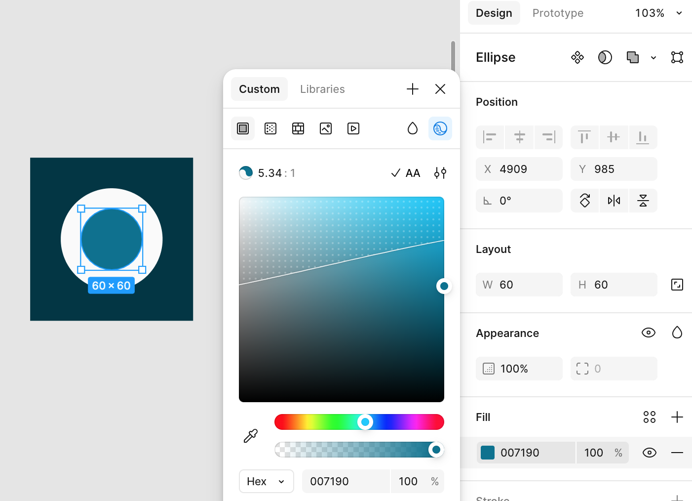
Figma's built-in color contrast checker is so helpful! I used to rely on a few different plugins to check color contrast. Some of those had features Figma is missing, but I love how integrated the Figma tool is. The line and dotted pattern to indicate where the contrast falls below the standard you are checking for is such a great feature. Of course there's room for improvement. And Figma has a long way to go before they can claim to be front-runners when it comes to accessibility features. But this seemingly small feature, is a huge step in the right direction.