The challenge
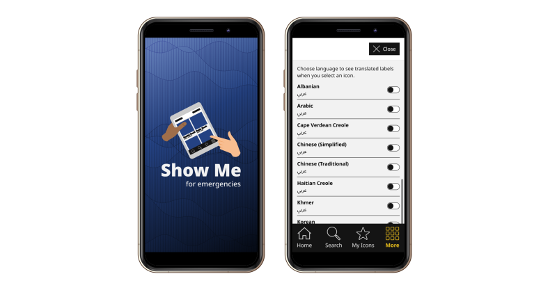
The Show Me for Emergencies app is a free, research-based tool to aid communication between public health and emergency workers and people who may experience difficulty hearing, speaking, or understanding information. Supporting 13 languages, the app needed a UX/UI refresh that improved usability, accessibility, and inclusivity for diverse users in high-stress situations.
What we did
At the time the project started there were 2 separate apps with overlapping functionality. One app was aimed at a variety of settings and situations, the other app was focused on communicating in Family Support Centers. One of our goals from the start was to combine both apps into one.
As always we started with formative research. We talked to the various audiences about their experiences with the previous version of the app, and we did a usability review of both existing apps.
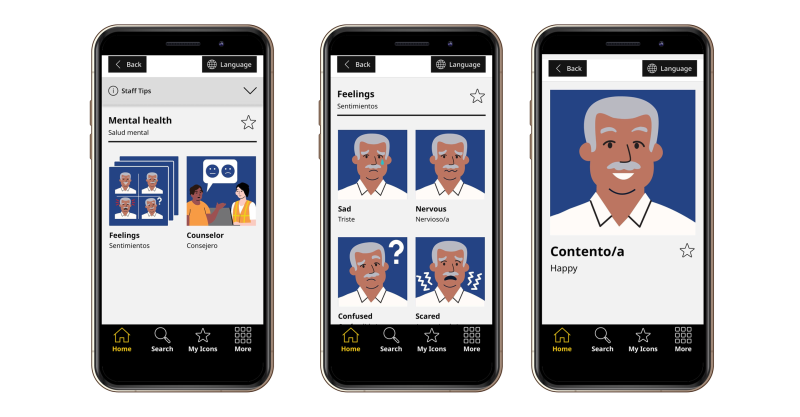
Based on the formative research we decided to do an overhaul of the information architecture. Instead of a linear and one-dimensional information hierarchy, we multi-homed the communication cards in a poly-hierarchy. This allows the same information to be featured in different places as needed, and supports many more mental models and situations.
In addition to adding several languages and a multitude of new translation cards, we also redesigned the iconography to have a friendlier look and feel and to implement best practices we've learned over the years designing products for people with cognitive disabilities or communication challenges.
Why it matters
When we did usability testing with the various audiences, we learned that the redesign was universally appreciated and that the various communication needs are met. Not only does the redesign expand the reach of the app in terms of languages and situations that are supported. It also improves accessibility and representation for a wider scope of people, with special attention to cognitive disability considerations.
The enhanced functionality and broadened scope was achieved while also simplifying navigation and improving on the usability of the app in stressful and challenging situations.
The refreshed app won the 2025 Clearmark Award for Best App and I received personal compliments from our client for my information architecture and application flows design.
This is really great! I appreciate how you were able to make this work for a variety of people in all kinds of situations. Your idea to implement taxonomies was key to making this flexible and efficient.