Healthy People 2030: Data Display
The challenge
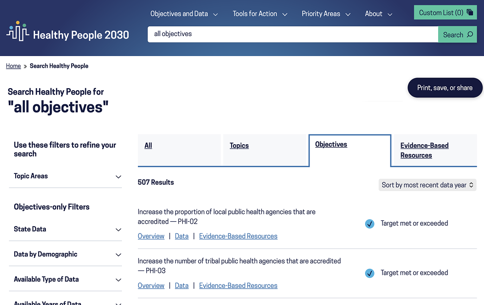
With over 500 objectives and tens of thousands of associated data points, the UI and interaction design of Healthy People 2030's data display was a big, fun challenge. Not only are the data complex and broad in scope, but the audiences are diverse too. The data visualizations needed to be user-friendly and work with a wide variety of devices and technologies.
What we did
Working in close collaboration with our clients at The Office of Disease Prevention and Health Promotion (ODPHP) and The National Center for Health Statistics (NCHS), I created a fully integrated data visualization tool that allows visualizations to be customized and filtered based on specific user needs. The data can be explored from a variety of perspectives and in multiple formats: charts, tables, and maps.
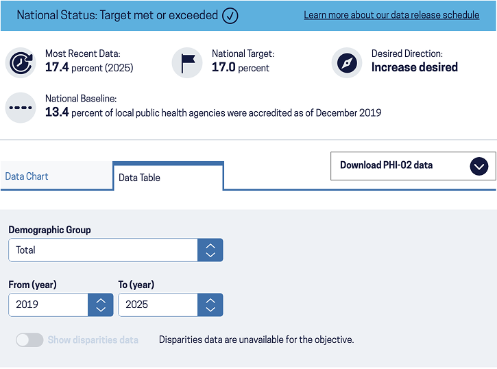
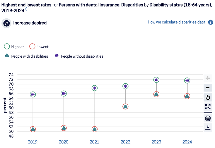
The visualizations integrate with each of the 500+ objectives in a way that makes it intuitive to start from a high level and drill down to increasing detail. Because understanding disparities is a high priority, we built a user-friendly way to find and interpret disparities data.
Why it matters
Compared to Healthy People 2020, we provided additional functionality while also improving discoverability and ease of use. This makes the vast amount of data more usable and more useful. The new data display interface has greatly increased adoption and engagement.
[What makes it easy to use health data?] "Being able to visualize that data, and perhaps sometimes give people the ability to choose how they want to see it or how they want to slice and dice and manipulate it." — Usability Research Participant