AKM Logo
My brother-in-law is an incredible interior design photographer. Over the years, I've had the pleasure of helping him out with his digital presence. Way back when, that included a custom WordPress website where I had the chance to experiment with atypical UI and IxD patterns (anyone remember "bottom of the window headers"?!). More about that in a future post.
Recently, Adam wanted to update his logo. The logo he was using was a simple lettermark that spelled "AKM".

As part of the refresh, we wanted to better match a photography business. The old logo read too much as a clothing or furniture brand. We also wanted it to explicitly communicate the business Adam is in.
I came up with 4 options. All have a full lockup that includes "Adam Kane Macchia Photography" and a square minimal companion logo. Macchia is emphasized in all 4 options. All are 1 color for maximal versatility.
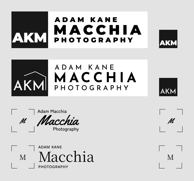
Looking at these from top to bottom, here's how I think of them.
- The first one takes cues from contemporary furniture companies. The Massimo Vignelli influence is clear.
- The second option leans more mid-century modern and real-estate.
- The script in the third option introduces a softer element and is inspired by Italian appliance logo designs.
- The last option is classic, elegant, and has an editorial interior design feel.
Adam decided to go with the last option, but we used the lettermark from the script one. It adds visual interest and softens the look and feel.

For purely aesthetic reasons (and we all know aesthetics can't be argued about), my favorites were option 1 and 3. Both of those have an appliances or furniture logo feel though. So Adam was probably right to go with the one that reads most editorial — after all, that's where a lot of his work ends up.
I'm not a professional logo designer. But ever since I designed the logo for the youth tennis club I was a part of as a 12-year old, I've enjoyed creating the occasional logo. There are many facets and nuances to creating logos which makes each project a fun challenge.
Speaking of logo design challenges, the 12-year old in me still finds this funny: