Notes (14)
Moto Trip Report
When I used to live in Vermont, I'd ride my motorcycle any chance I got. One of my favorite rides was from where I lived in Montpelier down to my in-laws in Chester. I was worried that moving to Massachusetts would mean much less riding.
Is it just me, or is AI already getting worse? For a while it felt like it was improving rapidly, but lately it seems to trip over itself as it overcomplicates things and tries to go about simple tasks in a roundabout way.
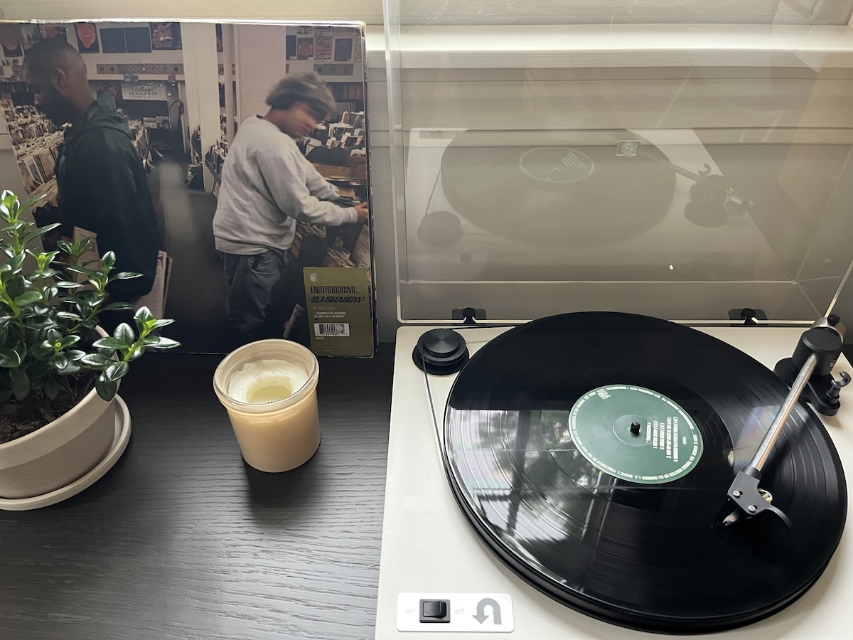
30 years later, still a favorite.
Playing around with Claude Design and realizing it very much behaves like an intern. I can get draft-level output from it, but need to hold its hand. There's lots of editing and re-prompting that needs to happen, but it's definitely faster than an actual human. My 2 main concerns are: how much work would it be for a developer to take this from prototype to production-ready? And, would it ever contribute cool, valuable, or surprising ideas like a good intern would?
MVPs. The good, the bad, and the ugly.
Some digital product design deliverables get a bad rap. Often the criticism is valid though. Take personas for example. They're often biased, disconnected from reality, not well-researched, just UX theater, etc. But, when done — and used — right, personas can be a valuable tool*.
Bruce Springsteen — Streets of Minneapolis
Woody Guthrie would be proud. We need more of this. Every single American* needs to speak up and take a stand. When we look back, "I didn't know" or "I didn't want to make things political" won't be an acceptable excuse. You do know, and at some point everything becomes political.
*Non-Americans can (and should) protest too: Billy Bragg — City of Heroes
Oh my, AI!
I’ll be honest with you, I don’t love the idea of artificial intelligence. There are many things about it I don’t like. Even the basic premise, that this technology is intelligent doesn’t match my definition of the term. Real intelligence requires more than connecting a…
Figma's Color Contrast Checker
Figma's built-in color contrast checker is so helpful! I used to rely on a few different plugins to check color contrast. Some of those had features Figma is missing, but I love how integrated the Figma tool is. The line and dotted pattern to indicate…
I just posted a free (!) UX writing tip to LinkedIn. You never know, you might find it helpful.
I'll always be a bit nostalgic for the NYC subway map I used when I lived there. But as a fan of Massimo Vignelli, I love that the new design is reminiscent of the 1972 Unimark map.